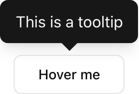
- Location:
sabo/src/components/ui/tooltip.tsx
When to use
- Brief, supplemental information on hover/focus. Keep content short.
- Avoid for critical information; use popovers/dialogs for longer text.
Usage
sabo/src/components/ui/tooltip.tsx
Key props
Offset in pixels between trigger and tooltip.
Global delay before showing. Our wrapper defaults to 0.
This component forwards all props from Radix Tooltip primitives (Provider/Root/Trigger/Content). Above are commonly used props. For the full API, see Radix docs: https://www.radix-ui.com/primitives/docs/components/tooltip
Styling tip
- Content uses foreground/background inversion; keep it short (1–2 lines).
- Arrow is included; adjust size via
[data-slot=tooltip-content]classes.
Accessibility
- Tooltips appear on hover and focus. Ensure triggers are keyboard focusable.