- Location:
sabo/src/components/ui/dialog.tsx
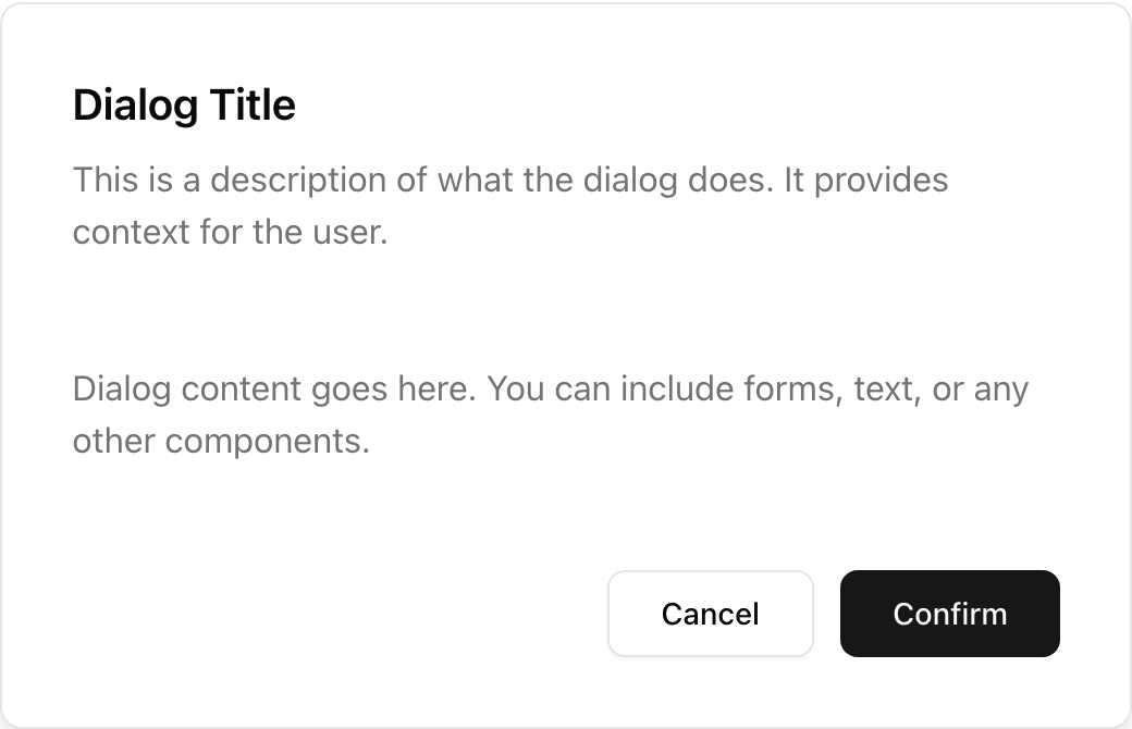
When to use
- Use for non-destructive tasks: forms, settings, previews, details.
- Dismissible via Esc or outside click (unless you disable it).
- Flexible body content with header/footer slots.
Accessibility
- Renders with proper dialog semantics; focus moves into the dialog.
- Return focus to the trigger when closed.
Minimal usage
sabo/src/components/ui/dialog.tsx
This component forwards all props from Radix Dialog primitives (Root/Trigger/Content, etc.). Above are commonly used props. For the full API, see Radix docs: https://www.radix-ui.com/primitives/docs/components/dialog