- Location:
sabo/src/components/ui/label.tsx
What it is
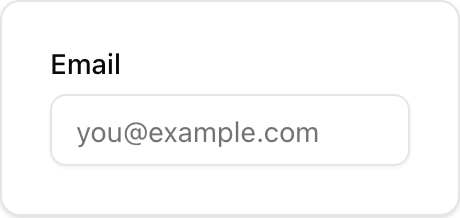
- Accessible text label for a form control using Radix Label.
- Associate with a control via
htmlForon the label and matchingidon the input.
When to use
- Whenever you render a form control (Input, Textarea, Select, etc.).
- Inside a
Fieldor alone next to a control.
How it differs from others
- Label vs Field: Label is only the text; Field is a layout wrapper that can include label, description, and error.
- Label vs Input: Label is non-interactive; Input is the actual control.
Minimal usage
sabo/src/components/ui/label.tsx
This component forwards all props from Radix Label primitives. Above are commonly used props. For the full API, see Radix docs: https://www.radix-ui.com/primitives/docs/components/label