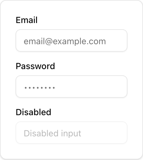
- Location:
sabo/src/components/ui/input.tsx
What it is
- Single form control that renders a styled
<input>. - Handles focus ring, disabled state, and invalid state (
aria-invalid).
When to use
- You need a text field.
- Pair with
Labelfor accessibility, or withFieldwhen you also want description and error text.
How it differs from others
- Input vs Field: Input is the control; Field is the wrapper for label/help/error layout.
- Input vs Label: Label just describes/associates a control; it’s not interactive.
- Input vs Input Group: Input Group combines an input with addons (prefix/suffix text, icons, buttons).
Minimal usage
sabo/src/components/ui/input.tsx