- Location:
sabo/src/components/ui/toggle.tsx
When to use
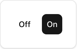
- Binary on/off or pressed/unpressed states (e.g., bold/italic, filters).
- Use a Switch for form field true/false; Toggle is for quick UI actions.
Usage
sabo/src/components/ui/toggle.tsx
Key props
default | outlinedefault | sm | lgInitial pressed state. The element reflects state via
data-state=“on” or “off”.Styling tip
- Use
data-[state=on]:…selectors to style the on‑state for icons/text. - Combine with tooltips or labels for clarity in icon‑only toggles.
Accessibility
- Provide an
aria-labelfor icon‑only toggles. - Ensure clear contrast for both on/off states and visible focus outlines.