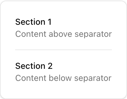
- Location:
sabo/src/components/ui/separator.tsx
When to use
- Visually divide content within cards, dropdowns, and pages.
- Choose orientation based on layout direction.
Usage
sabo/src/components/ui/separator.tsx
Key props
horizontal (default) | verticalIf
true (default), hidden from assistive tech. Set false if used as a semantic separator.This component forwards all props from Radix Separator primitives. Above are commonly used props. For the full API, see Radix docs: https://www.radix-ui.com/primitives/docs/components/separator
Styling tip
- Add
my-3/mx-3spacing around separators. - Change color via
bg-borderoverrides for stronger/lighter rules.
Accessibility
- Keep
decorative=truefor visual lines only. - If conveying structure, set
decorative=falseso screen readers announce it.